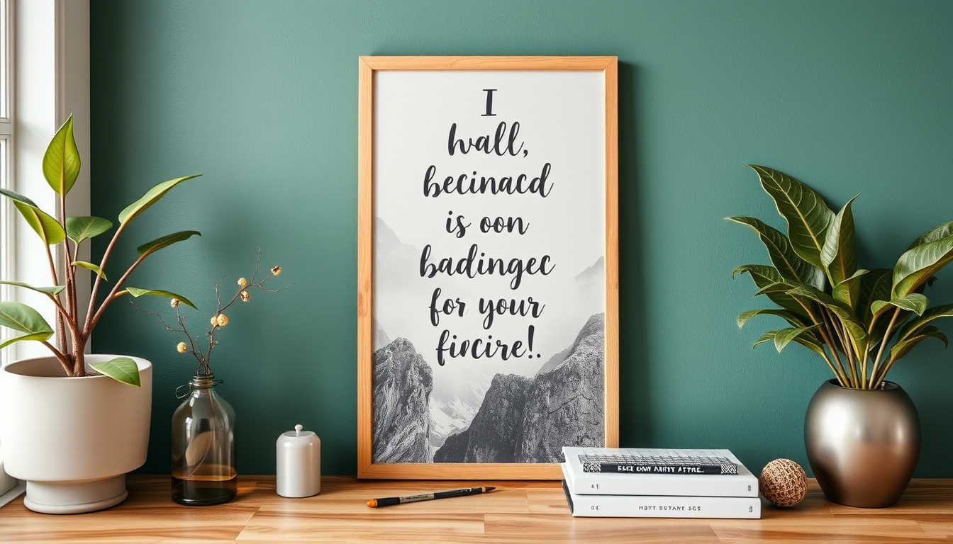
Ideas for Posters, Affirmation Prints, and Decor You Can Actually Sell
A lot of wall art looks good on screen.
Very little of it sells.
The difference usually isn’t talent or taste. It’s usefulness.
People don’t buy art just because it’s beautiful.
They buy it because it fits a space, a feeling, or a moment in their life.
When I design posters, affirmation prints, or decor using AI, I don’t start with aesthetics. I start with context.
Where will this live?
Who is it for?
What does it quietly say when someone walks past it every day?
Posters sell when they feel intentional, not generic.
Large abstract art with no emotional anchor struggles. Posters that perform well usually fall into a few repeatable structures.
Minimal typography paired with a single visual focus works because it reads from a distance.
Line-based or watercolor visuals with calm negative space feel at home in modern interiors.
City-inspired, nature-inspired, or architectural compositions sell better when they are restrained rather than dramatic.
Series matter more than single designs. One poster is decoration. Three matching posters feel like a designed space.
Triptychs, color-variant sets, and theme-based collections consistently outperform one-off pieces. Buyers want to imagine the art on their wall before they buy it.
Affirmation prints sell when they sound human.
Overly dramatic or spiritual language turns people away. The affirmations that work best feel grounded, short, and believable.
Statements like “I am learning to trust myself” outperform vague positivity.
Typography matters more than imagery here.
Clean, readable fonts with generous spacing feel calm and confident.
AI-generated backgrounds should support the words, not compete with them.
Neutral color palettes convert more reliably than loud ones.
Soft beige, sage, warm gray, dusty blue, and muted blush blend easily into real homes.
Highly saturated colors sell occasionally, but calm tones sell consistently.
Decor sells when it feels place-specific.
A kitchen print works when it’s light and playful. A bedroom print should feel slow and safe.
Office decor performs best when it’s motivating without being aggressive. AI art becomes sellable when it’s designed for a room, not just a style.
Texture is a quiet advantage. Watercolor washes, paper grain, linen effects, and subtle imperfections make AI art feel less digital and more tactile.
This is especially important for prints. People want wall art that feels warm, not synthetic.
One of the most reliable product types is printable sets.
Instead of selling a single affirmation, sell a bundle of ten. Instead of one poster, sell a coordinated pack.
Bundles feel more valuable and reduce the pressure on a single design to perform perfectly.
Mockups are not optional. People need to see the art in context.
A poster shown in a real frame on a neutral wall sells better than a flat image.
An affirmation print placed above a desk or bedside table helps buyers imagine ownership.
What doesn’t sell well is anything that feels unfinished or confused.
Mixed styles in one shop.
Inconsistent fonts.
No clear niche.
Buyers sense uncertainty immediately.
AI makes creation faster, but selling still depends on clarity.
When your art has a purpose, a place, and a quiet confidence, it becomes easier for someone to say yes.
The goal isn’t to make more art.
It’s to make art that belongs somewhere.
That’s what actually sells.


